Google Analytics now has customizable dashboards inside GA4.
Google officially documented the launch on September 9, 2026.
The new Dashboard report gives users a flexible canvas for placing important KPIs on one page.
You can drag dimensions and metrics onto the canvas. You can also move, resize, and organize the resulting visualizations.
For SEO teams, this solves a familiar GA4 problem.
Organic traffic, landing pages, engagement, AI referrals, and conversions often live across different reports. A dashboard can bring the most important metrics into one monitoring view.
That does not mean Dashboards replace Explore, Looker Studio, or the GA4 API.
The feature has important limitations.
Still, it provides a much faster way to monitor SEO performance inside GA4 itself.
This guide explains what Google released and how to build five useful SEO dashboards around it.
If you want to compare GA4 setups with other SEO practitioners, join Scale Xpert’s Discord community for SEO learning and genuine backlink exchange.
What Google Analytics Dashboards Actually Are
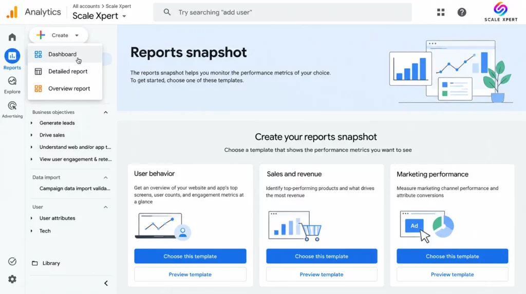
Dashboards are a new reporting surface inside Google Analytics.
Dashboards are a new reporting surface inside Google Analytics.
Google describes them as a way to view important KPIs on one consolidated page.
A Grid-Based Canvas
The interface uses a flexible grid.
You can manually position cards and resize them based on importance.
This makes it possible to place high-level KPIs at the top and diagnostic charts underneath.
Drag-and-Drop Building
Google lets you drag visualization types onto the dashboard.
You then drag dimensions and metrics into those visualizations.
This removes some of the repeated configuration work required in older GA4 reporting workflows.
Once the dashboard is ready, an Editor or Administrator can publish it.
The dashboard then appears in the Reports navigation.
Anyone with access to the property can view a published dashboard.
The guide to what Google Analytics 4 is and how GA4 differs from Universal Analytics provides the broader reporting context.
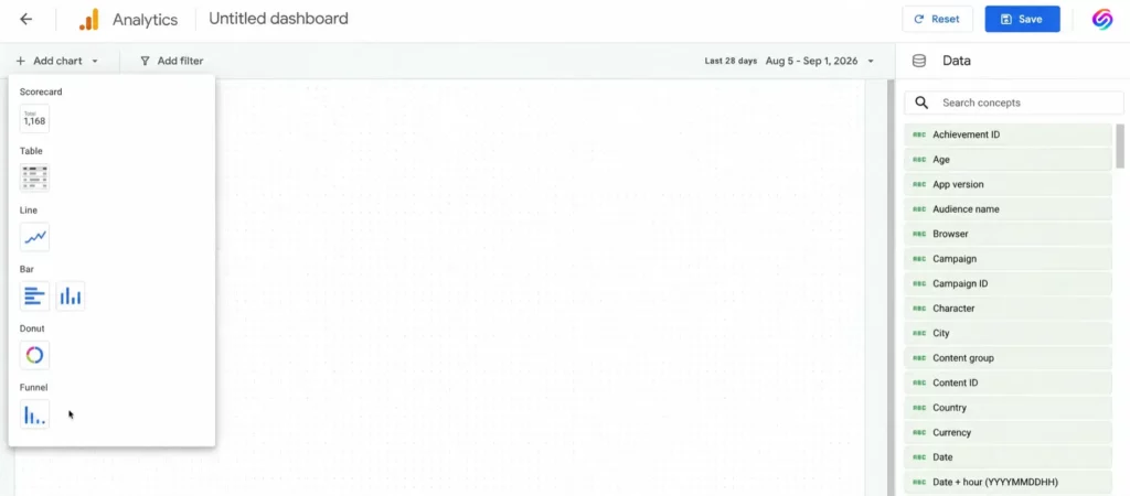
GA4 Dashboard Visualization Types
1. Scorecards
Scorecards display high-level KPIs.
They can also show percentage changes when a date comparison is applied.
2. Tables
Tables work well for detailed breakdowns.
Examples include landing pages, channels, devices, or campaigns.
3. Line Charts
Line charts show trends over time.
Google supports daily, weekly, and monthly granularity.
4. Bar Charts
Bar charts make comparisons between dimensions easy to scan.
5. Donut Charts
Donut charts show how individual categories contribute to a total.
6. Funnel Charts
Funnels visualize conversion steps and where users drop out.
Important GA4 Dashboard Limits
Understand the limits before replacing an existing reporting workflow.
15 Cards on Standard Properties
A standard Google Analytics property can contain up to 15 cards per dashboard.
30 Cards on Premium Properties
Premium properties support up to 30 cards.
No Segment Support Yet
Google currently lists segments as unsupported.
This matters for SEO because advanced organic-only analysis often depends on segments.
No Card-Level Comparisons
You cannot currently assign an independent comparison to each dashboard card.
Date comparisons can still support scorecard percentage changes at the report level.
No Dashboard API Support
Google also lists dashboard API access as unsupported.
This means the new dashboard is not a direct replacement for automated reporting built through the Data API.
Published dashboards are shared with the property.
They are not private personal dashboards for individual users.
Dashboards Do Not Replace Explore or Looker Studio
The new feature works best for routine monitoring.
It is less suited to advanced investigation.
Use Dashboards for Monitoring
Good use cases include:
- daily KPI checks
- weekly SEO health reviews
- organic landing page monitoring
- AI referral monitoring
- conversion monitoring
Use Explore for Deep Analysis
Explore remains better when you need:
- segments
- path analysis
- cohort analysis
- advanced funnels
- ad-hoc analysis
- multiple analytical breakdowns
Use Looker Studio for External Reporting
Looker Studio remains useful when you need to combine GA4 with other data sources.
It also works better when a report needs to reach people who should not have access to the GA4 property.
Why GA4 Dashboards Matter for SEO
SEO performance rarely fits into one GA4 report.
You may need Traffic Acquisition for channel performance.
Then you move to Landing Pages for content performance.
After that, you may check engagement and key events separately.
Dashboards reduce this navigation.
You Can See Relationships Faster
Suppose organic traffic drops.
Traffic alone does not tell you why.
You also want to know:
- Did engagement change?
- Did conversions change?
- Did one landing page lose most of the traffic?
- Did AI referrals grow?
- Did another channel compensate?
Putting these metrics on one page makes the relationship easier to see.
Before Building: Understand Organic Filtering
The new Dashboard feature does not currently support full GA4 segments.
That affects how you build SEO-specific views.
Use Session-Scoped Acquisition Dimensions
For traffic analysis, use dimensions such as:
- Session default channel group
- Session source
- Session medium
For organic reporting, the value you normally care about is:
Organic SearchDo Not Confuse User Acquisition With Session Acquisition
First user dimensions describe how a user was originally acquired.
Session dimensions describe how the current session arrived.
For routine SEO traffic monitoring, session-scoped dimensions are usually the more useful choice.
Dashboard 1: Daily Organic Health Check
This dashboard should answer a simple question:
Is organic performance behaving normally today?
Keep it focused.
Card 1: Organic Search Sessions
Visualization: Scorecard or channel table
Metric: Sessions
Dimension: Session default channel group
Focus on the Organic Search value.
If your dashboard setup does not allow you to isolate the channel exactly as needed, use a small channel table rather than forcing a misleading scorecard.
Card 2: Organic Engagement Rate
Visualization: Table or scorecard where supported
Metric: Engagement rate
Compare this with the normal organic baseline.
A sudden change may justify deeper investigation.
It does not prove a ranking or intent problem by itself.
Card 3: Organic Key Events
Visualization: Scorecard or table
Metric: Key events
Traffic without business outcomes can hide performance problems.
This card keeps conversion activity visible beside traffic.
Card 4: Organic Traffic Trend
Visualization: Line chart
Metric: Sessions
Granularity: Daily
Use a longer date range than one day.
A 28-day or 30-day view makes unusual movements easier to identify.
Card 5: Top Organic Landing Pages
Visualization: Table
Dimension: Landing page
Metrics:
- sessions
- engagement rate
- key events
This shows whether one page drives a large share of the site’s organic change.
Card 6: Traffic by Device
Visualization: Bar chart or donut chart
Dimension: Device category
Metric: Sessions
A device-specific issue can explain a traffic or conversion anomaly that looks sitewide at first.
Do Not Treat Bounce Rate as a Ranking Alarm
The original version of this dashboard used bounce rate as an early ranking warning.
That claim is too strong.
GA4 engagement metrics describe user behavior on your site.
They do not directly tell you how Google ranks the page.
A high bounce rate can be normal for a page that answers the user’s question quickly.
The guide to search intent drift and ranking declines explains how engagement data should be combined with Search Console and SERP analysis rather than treated as a standalone ranking signal.
Dashboard 2: AI Traffic Monitor
Google Analytics introduced a dedicated AI Assistant channel on May 13, 2026.
This makes AI referral monitoring much easier.
What GA4 Classifies as AI Assistant Traffic
Google now uses an ai-assistant medium for recognized AI referrals.
Those visits can appear under the AI Assistant default channel.
Google specifically mentioned sources such as ChatGPT, Gemini, and Claude in the release documentation.
Card 1: AI Assistant Sessions
Visualization: Scorecard or channel table
Metric: Sessions
Channel: AI Assistant
This establishes the basic volume trend.
Card 2: AI Assistant Engagement Rate
Visualization: Scorecard or table
Metric: Engagement rate
Compare this with other traffic sources.
Do not assume AI traffic will always have higher engagement.
Card 3: AI vs Organic Search Trend
Visualization: Line chart
Dimension: Session default channel group
Metric: Sessions
Use the chart to compare the growth direction of AI Assistant and Organic Search.
Card 4: AI Landing Pages
Visualization: Table
Dimension: Landing page
Metrics:
- sessions
- engagement rate
- key events
This identifies which pages receive AI-referred visitors.
Card 5: AI Key Events
Visualization: Scorecard
Metric: Key events
The goal is to determine whether AI traffic produces meaningful outcomes rather than only visits.
Card 6: AI Traffic by Source
Visualization: Bar chart or table
Dimension: Session source
Metric: Sessions
This can reveal whether ChatGPT, Claude, Gemini, Perplexity, or another source contributes most of the traffic.
The guide to the AI Assistant channel in GA4 and how to track AI referral traffic covers the dedicated channel in more detail.
How Valuable Is AI Referral Traffic?
AI traffic is still small on many websites.
However, some research suggests it can be highly qualified.
The Orbit Media Study
Orbit Media analyzed 97 B2B GA4 properties representing about 29 million visits.
Across that dataset, AI referrals converted into leads about three times more often than other organic traffic sources.
The pattern appeared on roughly two-thirds of the individual sites.
Do Not Use 3x as a Universal Benchmark
The study focused on B2B lead-generation websites.
Your ecommerce, publisher, travel, SaaS, or local-service site may behave differently.
Measure your own conversion rate.
Dashboard 3: Landing Page SEO Performance
This dashboard focuses on page-level organic performance.
It helps identify where SEO traffic and business outcomes actually come from.
Card 1: Top Organic Landing Pages
Visualization: Table
Dimension: Landing page
Metrics:
- sessions
- engagement rate
- average engagement time
- key events
- key event rate where available
This should be the main card.
Card 2: Landing Page Session Trend
Visualization: Line chart
Metric: Sessions
Track important landing pages over time.
If the dashboard becomes crowded, keep only your most business-critical page group.
Card 3: Organic Engagement
Visualization: Scorecard or table
Metric: Engagement rate
Use this metric as diagnostic context.
Do not treat it as a direct Google ranking factor.
Card 4: Key Events by Landing Page
Visualization: Bar chart
Dimension: Landing page
Metric: Key events
This identifies the pages that contribute most directly to business outcomes.
The three-phase content audit framework for finding conversion black holes explains how page-level conversion data can support content decisions.
Card 5: High-Traffic Pages With Weak Business Outcomes
Visualization: Table
Look for pages with strong sessions but weak key event performance.
These pages may need:
- better CTAs
- stronger internal links
- better intent alignment
- different offers
A low GA4 engagement rate does not prove Google is recording a “bad click.”
GA4 is your analytics system.
Navboost is part of Google’s search systems.
The two should not be treated as the same dataset.
The guide to Google Navboost, user signals, and click data covers what is publicly known about the system.
Dashboard 4: Content Decay Early Warning
This dashboard helps identify pages that may need further investigation.
Be careful with the word “decay.”
A traffic decline does not automatically mean the content decayed.
Card 1: Landing Page Traffic Change
Visualization: Table
Dimension: Landing page
Metric: Sessions
Use a date comparison at the dashboard level.
Year-over-year comparisons work well for seasonal websites.
Previous-period comparisons can help for faster-moving sites.
Card 2: Organic Traffic Trend
Visualization: Line chart
Metric: Sessions
Look for sustained declines rather than one unusual day.
Card 3: Engagement Trend
Visualization: Line chart
Metric: Engagement rate
If traffic and engagement both weaken, the page deserves a closer review.
Still, investigate Search Console and the SERP before editing the content.
Card 4: Key Event Trend
Visualization: Line chart
Metric: Key events
A page can lose traffic while keeping its business contribution relatively stable.
This card prevents traffic volume from becoming the only decision metric.
Card 5: High-Value Pages Losing Traffic
Visualization: Table
Prioritize pages that combine:
- meaningful historical traffic
- important conversions
- clear sustained decline
The guide to refreshing old content for better rankings covers the next step after identifying real decay candidates.
Do Not Use a Universal 20% Decay Threshold
A fixed decline threshold can create false alarms.
Some websites are highly seasonal.
Others experience major demand shifts.
A 20% decline may be normal for one page and severe for another.
Use Historical Baselines
Compare each page with its own normal performance.
Then confirm the decline using Google Search Console.
GA4 tells you what happened after users arrived.
Search Console tells you what happened in Google Search.
Dashboard 5: Conversion Attribution by Channel
This dashboard connects search visibility with business value.
It should answer one question:
Which acquisition channels produce meaningful outcomes?
Card 1: Key Events by Channel
Visualization: Bar chart
Dimension: Session default channel group
Metric: Key events
This puts Organic Search beside Paid Search, Direct, AI Assistant, Referral, and other channels.
Card 2: Sessions by Channel
Visualization: Bar chart
Dimension: Session default channel group
Metric: Sessions
Traffic volume provides context for the conversion chart.
Card 3: Key Event Rate by Channel
Visualization: Table
Compare efficiency rather than only total conversions.
Card 4: Organic Conversion Funnel
Visualization: Funnel chart
A useful simplified funnel might examine:
- sessions
- engaged sessions
- key event completion
For a detailed event-specific funnel, Explore may remain the better option.
Card 5: Top Converting Landing Pages
Visualization: Table
Dimension: Landing page
Metrics:
- sessions
- key events
- key event rate
These are the pages you should protect during redesigns, migrations, and content updates.
The guide to using Google Analytics 4 for SEO covers the broader connection between acquisition data and SEO decision-making.
How to Create Your First GA4 Dashboard
Google’s setup process is straightforward.
Step 1: Open Reports
Sign in to Google Analytics.
Open Reports from the left navigation.
Step 2: Create a Dashboard
Click:
+ Create → DashboardStep 3: Add a Visualization
Drag a scorecard, table, line chart, bar chart, donut chart, or funnel chart onto the canvas.
Step 4: Add Dimensions and Metrics
Drag the dimensions and metrics you need onto the visualization.
Step 5: Configure the Card
Use the editing panel to adjust the visualization.
Step 6: Resize and Organize
Move cards into a logical order.
Place high-level metrics first.
Place diagnostic tables and charts underneath.
Step 7: Save
Save the dashboard when the structure is ready.
Step 8: Publish
Click Publish to add the dashboard to the Reports navigation.
Who Can Build GA4 Dashboards?
Google requires either an Editor or Administrator role to create and publish dashboards.
Users with property access can view published dashboards.
This makes the feature useful for shared internal monitoring.
A Better Way to Build the Five SEO Dashboards
Do not build all five at maximum size on day one.
Start With the Daily Health Dashboard
Build five or six cards.
Use it for a week.
Remove anything you never act on.
Add the AI Dashboard Next
This is especially useful if AI Assistant traffic has become measurable.
Build Page-Level Dashboards After That
Landing-page and decay dashboards become more useful after you understand your normal channel-level behavior.
Build Conversion Reporting Last
First verify that your key events are configured correctly.
A beautiful dashboard cannot repair bad measurement.
Verify Your Measurement Before Trusting the Dashboard
A dashboard only visualizes the data GA4 receives.
It does not validate your tracking setup.
Audit Key Events
Make sure meaningful actions are marked correctly.
Do not classify trivial actions as business conversions.
Audit Referral Exclusions
Incorrect referral handling can distort attribution.
Audit Channel Classification
Check whether traffic appears in the correct default or custom channel.
The guide to setting up custom channel groups in Google Analytics 4 covers situations where the default channel definitions do not fit your reporting needs.
When to Use Custom Channel Groups
Google’s built-in AI Assistant channel now handles many recognized AI referrals.
You may still need a custom setup for sources outside Google’s classification.
Do Not Duplicate the Built-In AI Assistant Channel Blindly
Check your data first.
If Google already classifies the traffic correctly, creating a second overlapping category can make reporting harder to interpret.
What GA4 Dashboards Cannot Replace
Google Search Console
GA4 does not show you Google query impressions, clicks, or average search position.
You still need Search Console for search visibility analysis.
Rank Tracking
GA4 measures site activity.
It does not replace keyword-level SERP monitoring.
Looker Studio
Looker Studio still offers more flexibility for external stakeholder dashboards and blended data.
BigQuery
BigQuery remains important for event-level analysis and advanced data workflows.
Explore
Explore remains the stronger tool for advanced ad-hoc analysis.
A Simple Weekly GA4 SEO Review Routine
Monday: Organic Health
Review:
- organic sessions
- landing pages
- key events
- major anomalies
Wednesday: Landing Pages
Look for:
- traffic concentration
- page-level declines
- conversion changes
Friday: AI and Conversion Trends
Check:
- AI Assistant sessions
- AI landing pages
- channel conversion performance
- high-value SEO pages
Monthly: Content Decay Review
Combine the GA4 dashboard with Search Console.
Use both systems before making refresh decisions.
Common GA4 Dashboard Mistakes
Mistake 1: Filling All 15 Cards
More cards do not automatically produce better decisions.
A focused six-card dashboard can be more useful.
Mistake 2: Treating Engagement as a Ranking Factor
GA4 engagement metrics are not direct Search ranking reports.
Mistake 3: Using Traffic as the Only KPI
Always connect traffic with business outcomes.
Mistake 4: Using AI Traffic Benchmarks as Guarantees
Measure your own AI conversion performance.
Mistake 5: Forgetting Dashboard Limitations
No segments, no API support, and no card-level comparisons can matter for advanced reporting.
Mistake 6: Replacing Search Console With GA4
The tools answer different questions.
Mistake 7: Publishing Bad Tracking More Beautifully
Validate measurement before trusting the dashboard.
The Five SEO Dashboards at a Glance
| Dashboard | Main Purpose | Review Frequency |
|---|---|---|
| Daily Organic Health Check | Spot major organic traffic and conversion changes | Daily |
| AI Traffic Monitor | Track AI Assistant traffic and outcomes | Weekly |
| Landing Page SEO Performance | Compare page-level traffic, engagement, and conversions | Weekly |
| Content Decay Early Warning | Find pages that deserve deeper decline analysis | Monthly |
| Conversion Attribution by Channel | Connect organic and AI traffic with business results | Weekly or monthly |
Frequently Asked Questions
When Did Google Analytics Launch Custom Dashboards?
Google’s official release notes date the Dashboard launch to September 9, 2026.
Some industry coverage appeared on September 11 and later, which likely caused confusion about the launch date.
What Are GA4 Dashboards?
Dashboards are customizable single-page reports inside Google Analytics.
You can arrange metrics and visualizations on a grid-based canvas and publish the result to the Reports navigation.
What Visualization Types Are Available?
Google currently supports scorecards, tables, line charts, bar charts, donut charts, and funnel charts.
How Many Cards Can a Dashboard Have?
Standard properties support up to 15 cards.
Premium properties support up to 30.
Who Can Create a Dashboard?
An Editor or Administrator can create and publish a dashboard.
Anyone with property access can view a published dashboard.
Can I Use Segments in GA4 Dashboards?
Not currently.
Google lists segments as unsupported in the initial release.
Can I Give Every Card a Different Date Comparison?
No.
Google says card-level comparisons are currently unsupported.
Can I Access GA4 Dashboards Through the API?
No.
Dashboard API support is not available in the initial release.
Does GA4 Have an AI Assistant Traffic Channel?
Yes.
Google introduced an AI Assistant default channel in May 2026 for recognized AI referrals.
The channel can identify visits from recognized assistants such as ChatGPT, Gemini, and Claude.
Does AI Traffic Convert Three Times Better?
Not universally.
Orbit Media found roughly three times higher lead conversion rates in its dataset of 97 B2B websites.
Your own website may show a very different pattern.
Can GA4 Dashboards Replace Looker Studio?
Not completely.
Dashboards are useful for internal GA4 monitoring.
Looker Studio remains stronger for blended data, external reporting, broader sharing, and advanced presentation control.
Can GA4 Dashboards Replace Explore?
No.
Explore remains more suitable for segments, paths, cohorts, and deeper ad-hoc analysis.
Which SEO Dashboard Should I Build First?
Start with the Daily Organic Health Check.
It provides the fastest view of traffic, landing pages, engagement, and business outcomes.
Conclusion
GA4 Dashboards are one of the most useful reporting improvements Google Analytics has introduced for routine monitoring.
The feature officially launched on September 9, 2026.
It gives SEO teams a flexible way to bring important KPIs together inside GA4.
Start with five practical dashboard themes:
- Daily Organic Health Check
- AI Traffic Monitor
- Landing Page SEO Performance
- Content Decay Early Warning
- Conversion Attribution by Channel
Do not treat these dashboards as replacements for every analytics tool.
Google Search Console remains essential for search queries and impressions.
Explore remains better for advanced investigation.
Looker Studio remains useful for external and blended reporting.
The new GA4 Dashboard is strongest when you use it for fast, repeatable monitoring.
Keep the number of cards focused.
Choose metrics that lead to decisions.
Most importantly, connect organic and AI traffic with conversions rather than reporting visits alone.
A good SEO dashboard should not simply tell you what happened.
It should tell you where to investigate next.
Connect with SEO practitioners comparing GA4 dashboard configurations at Scale Xpert on Discord, a community for SEO learning and genuine backlink exchange.